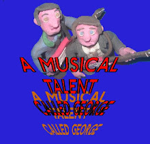
I cut out my characters and a background and asked people to give their ideas of how the layout of my poster should be. I forget who’s was who’s, but I don’t suppose that matters too much. It was just a bit of fun for them and a good way of getting other peoples opinions. Feed back on these would be very good, I'll number them so you can pick the best.
one

two

three

four

five

six

seven

eight

nine

ten


Four is the best, or three, they look like they've been placed carefully, not at random. Also, three fills lots of the background.
ReplyDeleteI quite like 8, but I think the title needs to be a little smaller maybe? It would look good if it was all tidied up with the background.
ReplyDeletei think i like 10 the best. following conventions of other film posters which i've seen.
ReplyDelete