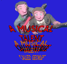
Here are some comments I have got since yesterday from facebook and deviantART, hopefully I’ll have a few more by tomorrow so I can finish my evaluation and make any changes.
Poster
"Really like the layout - and the James Bond style figure in the 'O'. The writing at the bottom doesn't look very clear in this version - would a different font be better?
Otherwise, very atmospheric and the different characters add interest and make you want to find out who they are"
"really cool poster, I like the 'coming 1972', really like you
All the characters are represented nicely, a definite MUST SEE!!"
Magazine
"Well set out - I like the combination of photo and model characters. All stands out without looking overcrowded. Can't easily read the white writing in the middle but would probably be fine when the cover is full size. Bar code could be smaller - draws almost as much attention as the stuff you're meant to be loooking at. 'Beyond the Earth' - Beyond should have capital letter (I know - pedantic)
Bearing in mind its black and white, it all stands out really well."
"Awesome work here
i guess the only thing i'd say could be better/clearer is the writing that's all scrunched. But aside from that, a cool front cover."
Trailer
"yea thats pretty good, you should try sorting out the clicks onthe sound though, maybe run the audio track through audacity or something then line it back on?"
"Nice trailer, love the detectives hat and coat"
Tuesday, 20 April 2010
Subscribe to:
Post Comments (Atom)


No comments:
Post a Comment