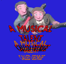
“BRITCOM animations presents Of Great Significance, directed written and produced by Ronan J.D. Sullivan, featuring Stan Moore and Sid Cup, also featuring the track “Japanimals” by Joe Sullivan”
Suggestion from facebook, “Maybe try the greyscale again?”

If there are anymore suggestions please tell me so I can finish my evaluation.


See, my ideas are the best ;)
ReplyDeleteOne suggestion though, Ronan. The "COMING SUMMER 1972" is in caps, which works and looks good, whilst the strap line "There's always somewhere to run..." is in lower case...
I know I keep using the word 'consistent', but maybe you should make the strap line in caps too?
Thank you. There is a reason for this though as it is meant to be a quote, that’s why I put it in quote marks. But I’ll see what it looks like before I do my final evaluation.
ReplyDelete