Wednesday 21 April 2010

FINAL PIECES

Here are the final versions of the poster, magazine, and trailer.
I amended the magazine once again as people said that the writing was still hard to read. On here it may be still hard to read, but when it is full size, it is much clearer.


Another comment for my trailer

i like it, although i couldnt quite hear you, maybe need to say it a bit louder, i think the music overtook your voice :) apart from that great :)

Tuesday 20 April 2010

Comments

Here are some comments I have got since yesterday from facebook and deviantART, hopefully I’ll have a few more by tomorrow so I can finish my evaluation and make any changes.

Poster
"Really like the layout - and the James Bond style figure in the 'O'. The writing at the bottom doesn't look very clear in this version - would a different font be better?
Otherwise, very atmospheric and the different characters add interest and make you want to find out who they are"

"really cool poster, I like the 'coming 1972', really like you
All the characters are represented nicely, a definite MUST SEE!!"
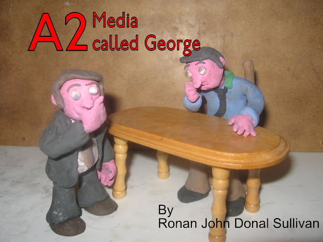
Magazine
"Well set out - I like the combination of photo and model characters. All stands out without looking overcrowded. Can't easily read the white writing in the middle but would probably be fine when the cover is full size. Bar code could be smaller - draws almost as much attention as the stuff you're meant to be loooking at. 'Beyond the Earth' - Beyond should have capital letter (I know - pedantic)
Bearing in mind its black and white, it all stands out really well."
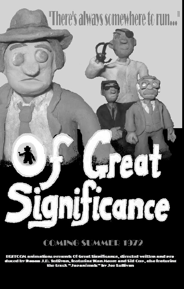
"Awesome work here
i guess the only thing i'd say could be better/clearer is the writing that's all scrunched. But aside from that, a cool front cover."

Trailer
"yea thats pretty good, you should try sorting out the clicks onthe sound though, maybe run the audio track through audacity or something then line it back on?"

"Nice trailer, love the detectives hat and coat"

Monday 19 April 2010

Final Poster

Here is the poster for my film. At the bottom it reads

“BRITCOM animations presents Of Great Significance, directed written and produced by Ronan J.D. Sullivan, featuring Stan Moore and Sid Cup, also featuring the track “Japanimals” by Joe Sullivan”

Suggestion from facebook, “Maybe try the greyscale again?”


If there are anymore suggestions please tell me so I can finish my evaluation.

On posters.

On film posters they have at the bottoms info on who made, stared, and helped on the film.

POSTER

This is some development of a poster idea, please comment.


Noir style

I had another look at film posters. I googled Film Noir posters and got this front cover of a book. I really liked the layout so tought i might take elemants of this.

Friday 16 April 2010

FINAL Final Cover

Looking back myself, I decided that I should change the colour of the articles advertised from grey to white. Now you can read them better. I also moved the EXCLUSIVE!, a little to the right.

FINAL COVER

This is what my final cover looks like. I have made it completely black and white to keep with the old Film Noir look. I think the picture I chose as I think that it really stands out. Also the SPLIT picture works well too and making my picture bigger and changing the colure made it fit better. When mine was coloured, the attention was drawn more towards the SPLIT one. Thank you Amy for letting me use it. I am pleased with the result but if there are any suggestions on how to improve it, I will change it if I feel it would work.

Cover development

These are some print screens of how I used publisher to do my front cover.


More magazine development

Here is more development for my film mag. I’ve come up with a new title “FILM FOCUS”. I have also use that film noir typeface and style for the cover. To keep wit the noir style, I took away the superhero and the bright reds as they didn’t work and drew your attention away from the main feature. I also have enlarged the detective.


Again, any suggestions are welcome.

FINAL TRAILER

This is my final trailer, unless any improvements are suggested.

I think that the black and white effect worked out really well in the final edit as well as making the colour quality better, a challenge I was faced with from the very start. I also changed the titles slightly and set them to a black background. In keeping with the Film Noir theme, I changed the typeface at the end, as the style of it looks more fitting.
Tell me what you think…

More Noir

I have looked at other film noir pictures that use black and white. These include not just old 50s detective films, but more resent ones like schindler's list, goodnight and good luck, and sin city. I have decided to give this look a go with my trailer.