I have spoofed the teaser trailer for the dark knight to have a practice for my trailer. Underneath it is the original.
Monday 28 December 2009
More Poster
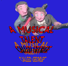
Again I have looked at one of my favourite films “THE DARK KNIGHT”, and used the idea of the poster with my characters.

Sunday 27 December 2009
Poster Development.
Here are two versions of the same poster but one has a sort of background in the “O” the other doesn’t. Tell me what looks better and what else I can do as I’m still developing it.
.bmp)
.bmp)
.bmp)
.bmp)
Wednesday 23 December 2009


Monday 7 December 2009
office scene
This is the final cut of the office scene for my A2 Media trailer. Im sort of happy with the way it came out. Tell me what you think
Thursday 19 November 2009
Good Editing
Here is a good example of how you can tale any film and change the look of it through editing. I really like this. It shows what can be done with editing and how important it is.
Tuesday 10 November 2009
Poster Development
I used the same image to see how the typefaces would look. Again any other suggestions are welcome.
.bmp)
.jpg)
Here I put the siluett man in the “O”.
Thanks for the suggestion Amy.
.bmp)
This one is done in the style of a Polaroid, with the handwriting typeface.
Again thanks for the suggestion Amy.

.bmp)
.jpg)
Here I put the siluett man in the “O”.
Thanks for the suggestion Amy.
.bmp)
This one is done in the style of a Polaroid, with the handwriting typeface.
Again thanks for the suggestion Amy.


Monday 9 November 2009
Titles
Here are some titles I might use for my poster, pick what one looks best.


Here are some comments I have got so far…
I like the “S” on number 4.
I like the way 5 is drawn.
I like number 1.
I like your comments.
I think 2 would be the best if it had the man from 1 on it.
I like the man on 1.

Here are some comments I have got so far…
I like the “S” on number 4.
I like the way 5 is drawn.
I like number 1.
I like your comments.
I think 2 would be the best if it had the man from 1 on it.
I like the man on 1.
Wednesday 4 November 2009
Set Build
I’ve been making some progress with my set building; it takes longer than I thought. I started off with the office of the MI5 boss in readiness for the scene on the storyboard.
The furniture is a mixture of dolls house (the book shelf and globe I borrowed from my sister), and stuff I made from clay (the desk and chair).
.jpg)
I tried out cardboard for the desk first, but clay was more stable and looked better.

.jpg)
.jpg)
.jpg)
Comments from facebook:
Awww, he's cute
The little bookshelf and globe are really cool too!
Love the claw... :D
Tuesday 3 November 2009
A quick promotional thing, the sort of thing you would read on the back of a DVD case.
Quentin Knox was a privet detective, until one day he took a picture of great significance. Now he has been recruited by MI5 and sent on a mission of great significance. He must face terrors and evil on his journey to… well save the world he assumes. He isn’t entirely sure what he is meant to know which is so important, nor does he know what the exact nature of his mission is. But times are hard and he needs the money.
Poster idea
I have also started to design my poster as well.
.jpg)
.jpg)
I have put on a slogan “THERE IS ALWAYS SOMEWHERE TO RUN” as a lot of film slogans go something like, “THERE’S NOWHERE TO RUN,” or something of that nature. So I thought I would turn it around a bit.
.jpg)
.jpg)
I have put on a slogan “THERE IS ALWAYS SOMEWHERE TO RUN” as a lot of film slogans go something like, “THERE’S NOWHERE TO RUN,” or something of that nature. So I thought I would turn it around a bit.
storyboard
Today I did a storyboard for one of the scene I plan to animate. My intention at the moment is to animate full-length scenes, and then cut them down to fit into my trailer. It just depends on how much time I end up with.

Click on an image to enlarge.


Click on an image to enlarge.


Tuesday 27 October 2009
trailers
Some of the trailers I have been looking at for research I put into my favourites box on my youtube page. There are also other stop motion things I looked at on there as well. On of my favourites was “The Hitchhikers Guide to the Galaxy” one. This is one of my favourite books. The film I thought was good as a film, but not as good as the book, but nether was the TV series.
I liked the way that on the trailer, it gave the guides definition of a film trailer, like it does for everything in the film. I thought this was a really clever way of promoting the film, especially for those who knew the book, radio series, and TV series.
The Hitchhikers Guide to the Galaxy definition of a trailer
Movie trailers are designed to give you an idea about the film in question in a very short space of time. Typically they begin with the introduction of a main character who will very shortly have something utterly fantastic happen to him that someone just had to make a movie about it. Often this section is preceded with the words in a world, but sometimes not. Trailers also normally employ a deep voice that sounds like a seven-foot tall man who has been smoking cigarettes since childhood. The goal is to create a peace of advertising that is original and exiting yet intelligent and provocative, in other words lots of things blowing up, occasionally interrupted by a girl in a bikini. Generally trailers feature heartless evil villains, hideous creatures, dolphins, physical violence, and of course the promise of true love. And lastly there is a final montage often set to rock music and designed to simply blow whatever synapses you have left in your brain. This covenants in the reveal of the main title, followed by the release date, so that the audience can plan the next few months of their life accordingly.
Saturday 24 October 2009
Evil Changes
One of the changes I made to the character of the evil doctor was his hand. I first turned it into a mechanical hand, but it was later suggested that it should be a claw.
.jpg)
.jpg)
Comments: Love the claw... :D
.jpg)
.jpg)
Comments: Love the claw... :D
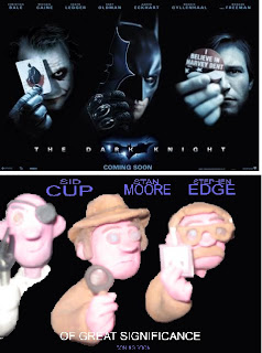
Poster Spoofs
Here are some of the posters I looked at and parodied useing paint, and the comments I got from them.
.bmp)
I like this but feel that there is something missing.
But i don't know what. :/
i agree with rosie! it's really good, but there's something missing from it :| maybe the writing? add more shadow to it?? :D
It's ok, a bit rough around the edges but a great concept. i like the bad guy in the back (i'm assuming he's the bad guy) cos it's like the skull in the back of the Indy poster and the good guy in the front, like Indy. i like how he is in almost the same position as Indy too. But yea, erm...the edges are a little rough and the lettering could be a little better, not that i'm dissing but it could...that's my honest opinion
.bmp)
hahahaha, i lol'd at this :')
this is great
Me too, this is my favorite, Ron!
i have to say....most confusing one of the 3. erm, why Jaws, just a little confused by that, but i guess random is good. ok, so it's rather unique to say the least. The placements are great again, the bad guy and the good guy right where they should be
definately better cut out on this one though, hardly noticable around the edges, well done for that!!! a cool and original concept.
Of the three this is my favourite, its a simple design and the key character roles are shown clearly. It is 'cleaner' in a sense that any graphics from the previous images are pretty much erased (although on closer inspection behind Mr Eye Patch's head I can see where you've tried to use paint to remove the shark) but its cleaner than the others.
Conclusion, clean, simple and clear. Also sometimes keeping it simple instead of overcrowded, has the best affects.
Oh and one last thing, Mr Eye Patch and Mr Clearly-the-Good-Guy are a tad too close. On the other poster there is a clear gap, in this they are too close. Unless that was intentional to imply that Mr Clearly-the-Good-Guy might get caught out?
Anyway, favorite of the three. Nice work on all of 'em btw, I like them all.

i like this one!! the line up is good...works really well :)
this is the best :D
I'd love to see these films with Knightly replaced by him, haha
think this one is my favourite one of the 3. The fact that Keira Knightley has been replaced by an old guy with a beard is just hilarious, good placing there!
Erm, again, a little rough around the edges but the way you've covered up the title is really good, hardly noticable. not sure about the font though, it could have been more like the original that was one the poster, i think that might have fitted better. Again, the placement of the main hero in the front makes sense, cos Johnny Depp is the star so that's in the right place and again the villian is in the right place. i think this is the best one of the three, honest opinion
.bmp)
I like this but feel that there is something missing.
But i don't know what. :/
i agree with rosie! it's really good, but there's something missing from it :| maybe the writing? add more shadow to it?? :D
It's ok, a bit rough around the edges but a great concept. i like the bad guy in the back (i'm assuming he's the bad guy) cos it's like the skull in the back of the Indy poster and the good guy in the front, like Indy. i like how he is in almost the same position as Indy too. But yea, erm...the edges are a little rough and the lettering could be a little better, not that i'm dissing but it could...that's my honest opinion
.bmp)
hahahaha, i lol'd at this :')
this is great
Me too, this is my favorite, Ron!
i have to say....most confusing one of the 3. erm, why Jaws, just a little confused by that, but i guess random is good. ok, so it's rather unique to say the least. The placements are great again, the bad guy and the good guy right where they should be
definately better cut out on this one though, hardly noticable around the edges, well done for that!!! a cool and original concept.
Of the three this is my favourite, its a simple design and the key character roles are shown clearly. It is 'cleaner' in a sense that any graphics from the previous images are pretty much erased (although on closer inspection behind Mr Eye Patch's head I can see where you've tried to use paint to remove the shark) but its cleaner than the others.
Conclusion, clean, simple and clear. Also sometimes keeping it simple instead of overcrowded, has the best affects.
Oh and one last thing, Mr Eye Patch and Mr Clearly-the-Good-Guy are a tad too close. On the other poster there is a clear gap, in this they are too close. Unless that was intentional to imply that Mr Clearly-the-Good-Guy might get caught out?
Anyway, favorite of the three. Nice work on all of 'em btw, I like them all.

i like this one!! the line up is good...works really well :)
this is the best :D
I'd love to see these films with Knightly replaced by him, haha
think this one is my favourite one of the 3. The fact that Keira Knightley has been replaced by an old guy with a beard is just hilarious, good placing there!
Erm, again, a little rough around the edges but the way you've covered up the title is really good, hardly noticable. not sure about the font though, it could have been more like the original that was one the poster, i think that might have fitted better. Again, the placement of the main hero in the front makes sense, cos Johnny Depp is the star so that's in the right place and again the villian is in the right place. i think this is the best one of the three, honest opinion
Research
So the spy one was the most popular of the three. So I preceded to tale a look at other films and their trailers.
I watched spoof films like the pink panther series, Austin Powers, and Carry on spying, along with more serious toned spy films like the James Bond series.

I also looked at a variety of film posters to get an idea for my layout.

I also added two other characters using the same men, and gathered the comments.
.jpg)
very good, and very realistic... XD
Media comments
Here are some of the comments people made on my ideas
General
That’s cool!
They all look pretty good
I think they look really well made!
It’s just the attention to detail, which just makes them all look, that bit more interesting
You should do a slasher film one
All good.
Very nice and individual
Do all three then pick the best you have until Christmas.
Spy film.
The villain should have a claw.
Well I think all three are good ideas... I think my favourite would have to be the spy figures as I think they have different looks, whereas the 2 characters are very similar on the other two shots. I also like the little accessories.
This is my favourite of the three. Just looks intriguing. Love the characters as well.
Taller bloke looks sinister the way he is looking over the agent type bloke, that’s what I like about it.
The spy one, defiantly the spy’s.
Umm personally I think the spy 1t looks quite interesting it would be a good angle
Really good, the guy reminds me of Inspector Gadget a little bit.
The spy one looks pretty good
This is my favourite! The man in the brown coat is really cute, and the other guy looks cool.
I like the spy one because the little man looks cool like an inspector, like Sherlock Holmes or something.
Its effective
I like the camera
His hat is AWESOME!! The bad guy is cool as well, very sinister looking
I think I prefer the spy one to be honest. I love the guy in the background with the eye patch.
This is my favorite because the man is wearing an eye patch and the other guy looks like a tourist looking at Big Ben or something, or maybe he's a detective!
I like the photographer, suggests there's some mystery to the scene!!! love it :)
He looks really scared too, and his eyes looking up suggest there's something big in front of him. A big mystery? Hurhur.
Zombie film
I love this one! :D
Maybe they should have sort of more greeny skin, if they're zombies?
I agree with Tegan, they just look a bit beat up at the moment.
Well I like the zombie one because you can be quite clever with it if you get a good idea; I just like the way the models are made!
The zombies one is good
I like this one, love how the arm is missing. But Tegan is right; they probably should be greenier
I like the way the eyes look a bit crazy
They look like they have been in a fight rather than zombies
They should be mouldier
I think maybe the zombie one should perhaps have torn clothes maybe? Or a bone sticking out, or something
I think horror
I bet plasticine is pretty good for making zombie films
I love this one! : D
hahaha, I am loving this photo :')
Cowboy film
This is my favourite, I love his moustache.
I really like this one too, but wouldn't the set be harder to make than the others?
Its effective the way the cowboys are positioned is good in the cowboy one and the moustache is cool
I love the handlebar moustache, its good
Quite liked the cowboy one
I really like the look of the plasticine people! The idea might be a bit more demanding than the other two because people expect it to be set in a wild west-ish set
I like this. Original, not enough cowboy films out there :)
Options
To begin with, I took two plasticine characters. I then gave three different options of what sort of film trailer I would do, to see what one would be the most popular. I put these ideas onto deviant art ( http://routemaster.deviantart.com/ ) to gain comments and votes. After that I put them onto facebook as well and realised that I could gain more comments from that, as it was a bigger network of people.
The opotions were...
cowboy film
.jpg)
a spy film

or some sort of horror film
.jpg)
I also later animated these ideas to make it more interested for my audience, and put it onto youtube.
The opotions were...
cowboy film
.jpg)
a spy film

or some sort of horror film
.jpg)
I also later animated these ideas to make it more interested for my audience, and put it onto youtube.
For my media A2, I intend to do an animated film trailer, promotional poster, and magazine front cover. The genre I intend to do is spoof comedy and will be trying o aim it at a wide range of social groups as possible.
The animation style I will be using will be stop motion with plasticine characters. This has proven to appeal to a wide range of age, and gender with the success of other stop motion classics like Wallace and Gromit from Aardman studios, The Nightmare Before Christmas, and many others.
I will be looking at these films along with other spoof films, and none spoof films with the same genre as I will be doing.
Subscribe to:
Posts (Atom)