
.bmp)
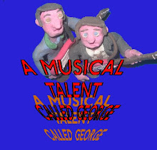
I like this but feel that there is something missing.
But i don't know what. :/
i agree with rosie! it's really good, but there's something missing from it :| maybe the writing? add more shadow to it?? :D
It's ok, a bit rough around the edges but a great concept. i like the bad guy in the back (i'm assuming he's the bad guy) cos it's like the skull in the back of the Indy poster and the good guy in the front, like Indy. i like how he is in almost the same position as Indy too. But yea, erm...the edges are a little rough and the lettering could be a little better, not that i'm dissing but it could...that's my honest opinion
.bmp)
hahahaha, i lol'd at this :')
this is great
Me too, this is my favorite, Ron!
i have to say....most confusing one of the 3. erm, why Jaws, just a little confused by that, but i guess random is good. ok, so it's rather unique to say the least. The placements are great again, the bad guy and the good guy right where they should be
definately better cut out on this one though, hardly noticable around the edges, well done for that!!! a cool and original concept.
Of the three this is my favourite, its a simple design and the key character roles are shown clearly. It is 'cleaner' in a sense that any graphics from the previous images are pretty much erased (although on closer inspection behind Mr Eye Patch's head I can see where you've tried to use paint to remove the shark) but its cleaner than the others.
Conclusion, clean, simple and clear. Also sometimes keeping it simple instead of overcrowded, has the best affects.
Oh and one last thing, Mr Eye Patch and Mr Clearly-the-Good-Guy are a tad too close. On the other poster there is a clear gap, in this they are too close. Unless that was intentional to imply that Mr Clearly-the-Good-Guy might get caught out?
Anyway, favorite of the three. Nice work on all of 'em btw, I like them all.

i like this one!! the line up is good...works really well :)
this is the best :D
I'd love to see these films with Knightly replaced by him, haha
think this one is my favourite one of the 3. The fact that Keira Knightley has been replaced by an old guy with a beard is just hilarious, good placing there!
Erm, again, a little rough around the edges but the way you've covered up the title is really good, hardly noticable. not sure about the font though, it could have been more like the original that was one the poster, i think that might have fitted better. Again, the placement of the main hero in the front makes sense, cos Johnny Depp is the star so that's in the right place and again the villian is in the right place. i think this is the best one of the three, honest opinion
No comments:
Post a Comment