

Comment
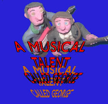
"The guy in the brown jacket - make him central? Because he's the main character, right?
Have the good guys over his shoulder on one side, and the guy with the claw on the other? That shows the split, kinda thing.
Annnnd, I'd make the title straighter, just so it looks a bit more professional? :P"
Amys quick design


looks much better now, it shows the split between good and evil
ReplyDeleteHaha, you put my design on here!
ReplyDeleteI think he looks better in the foreground :)
Great stuff Ron, this is really using the blog and face book how its meant too. Keep it going!
ReplyDelete